How to Create a Column Chart in Google Sheets


Step-by-Step Guide to Creating a Column Chart
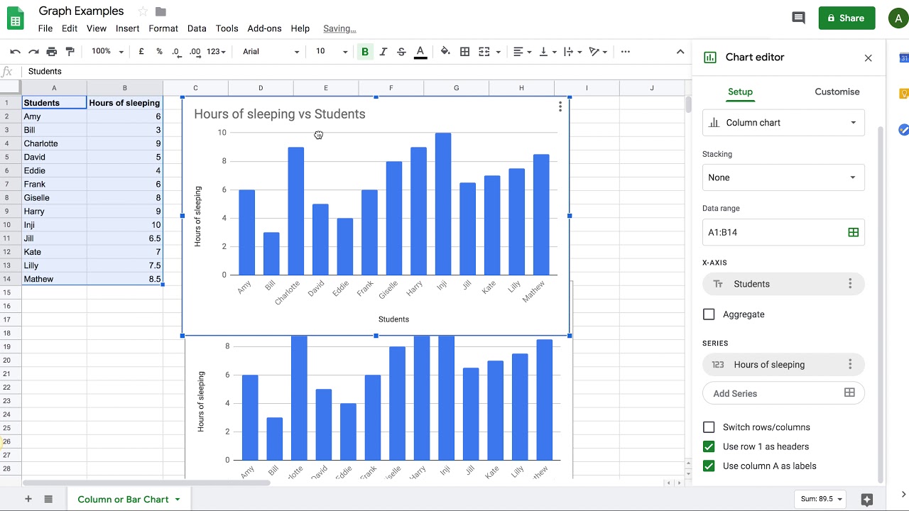
Google Sheets is a powerful tool for data analysis and visualization. One of the most effective ways to represent data in Google Sheets is by using a column chart. A column chart is a type of chart that uses vertical bars to display data, making it easy to compare values across different categories. In this article, we will show you how to create a column chart in Google Sheets.
To create a column chart in Google Sheets, you need to start by selecting the data range that you want to chart. This can include headers and data values. Once you have selected the data range, go to the 'Insert' menu and click on 'Chart'. Google Sheets will automatically create a chart based on your data. You can then customize the chart as needed to make it more visually appealing.
Customizing Your Column Chart
Now that you have created your chart, you can customize it to suit your needs. You can change the chart type, add titles and labels, and modify the colors and fonts used in the chart. You can also add data labels, error bars, and other elements to make the chart more informative. To customize your chart, click on the 'Customize' tab in the chart editor and explore the various options available.