How to Create a Bar Chart in Excel: A Step-by-Step Guide

Understanding Bar Charts and Their Benefits
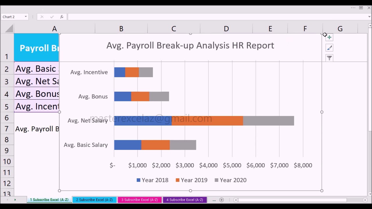
Creating a bar chart in Excel is a great way to visualize and compare data. Bar charts are particularly useful for showing categorical data, such as sales figures or website traffic, and can help you identify trends and patterns in your data. In this article, we'll show you how to create a bar chart in Excel and provide tips on how to customize it to suit your needs.
To create a bar chart in Excel, start by selecting the data you want to chart. This should include the categories you want to compare, as well as the values you want to display. For example, if you're creating a chart to show sales figures by region, your data might include the region names in one column and the sales figures in another. Once you've selected your data, go to the 'Insert' tab in the Excel ribbon and click on the 'Bar Chart' button.
Customizing Your Bar Chart
Bar charts are a type of chart that uses bars to display data. They're commonly used to compare data across different categories, and can be used to show trends and patterns in data. One of the benefits of using bar charts is that they're easy to read and understand, even for large datasets. They're also highly customizable, allowing you to change the appearance and layout of the chart to suit your needs. Customizing Your Bar Chart
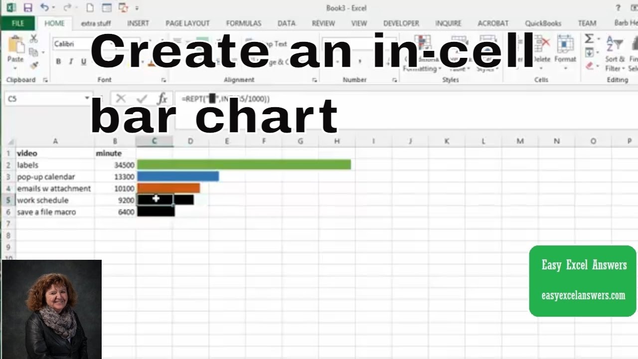
Once you've created your bar chart, you can customize it to suit your needs. This might include changing the colors and fonts used in the chart, adding labels and titles, and adjusting the layout and size of the chart. You can also use Excel's built-in formatting tools to add effects such as shadows and 3D effects to your chart. By customizing your bar chart, you can make it more engaging and effective at communicating your data to others.